A TRAINING APP
A neurodiversity training app for educators

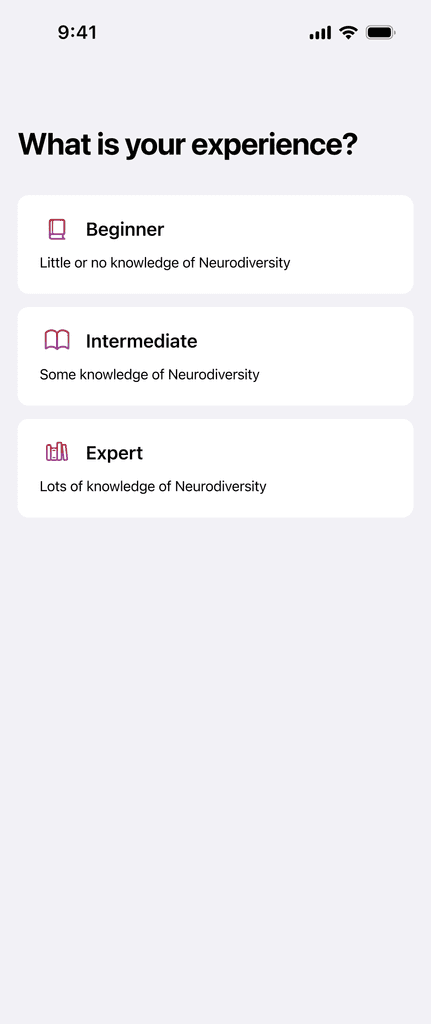
The product
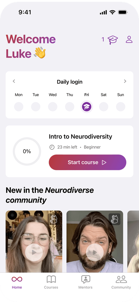
Teachability is a mobile app I designed to help university lecturers feel more confident supporting neurodiverse students.
It offers short, accessible courses, one-on-one mentoring, and a community space where educators can share advice and experiences. Everything’s designed with accessibility in mind—from dyslexia-friendly layouts to BSL support—so it’s truly usable for everyone.
The idea is to give lecturers the tools and support they often don’t get through formal training, in a way that’s flexible, inclusive, and human. Whether someone’s just starting out or has been teaching for years, Teachability helps them create a more understanding and inclusive classroom.
Research
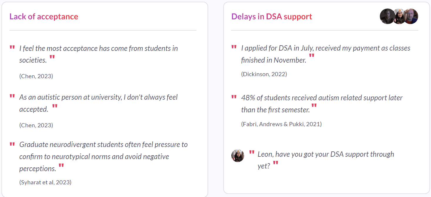
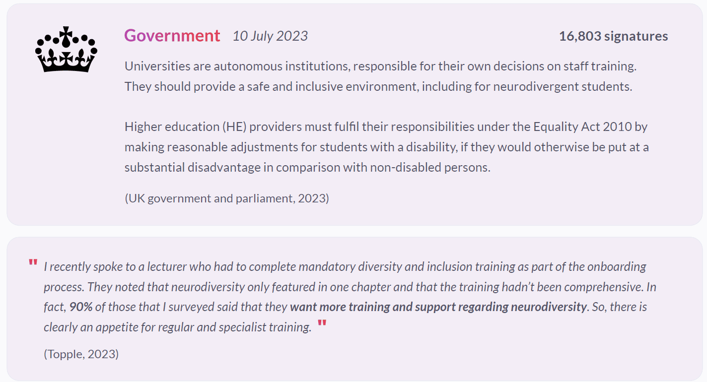
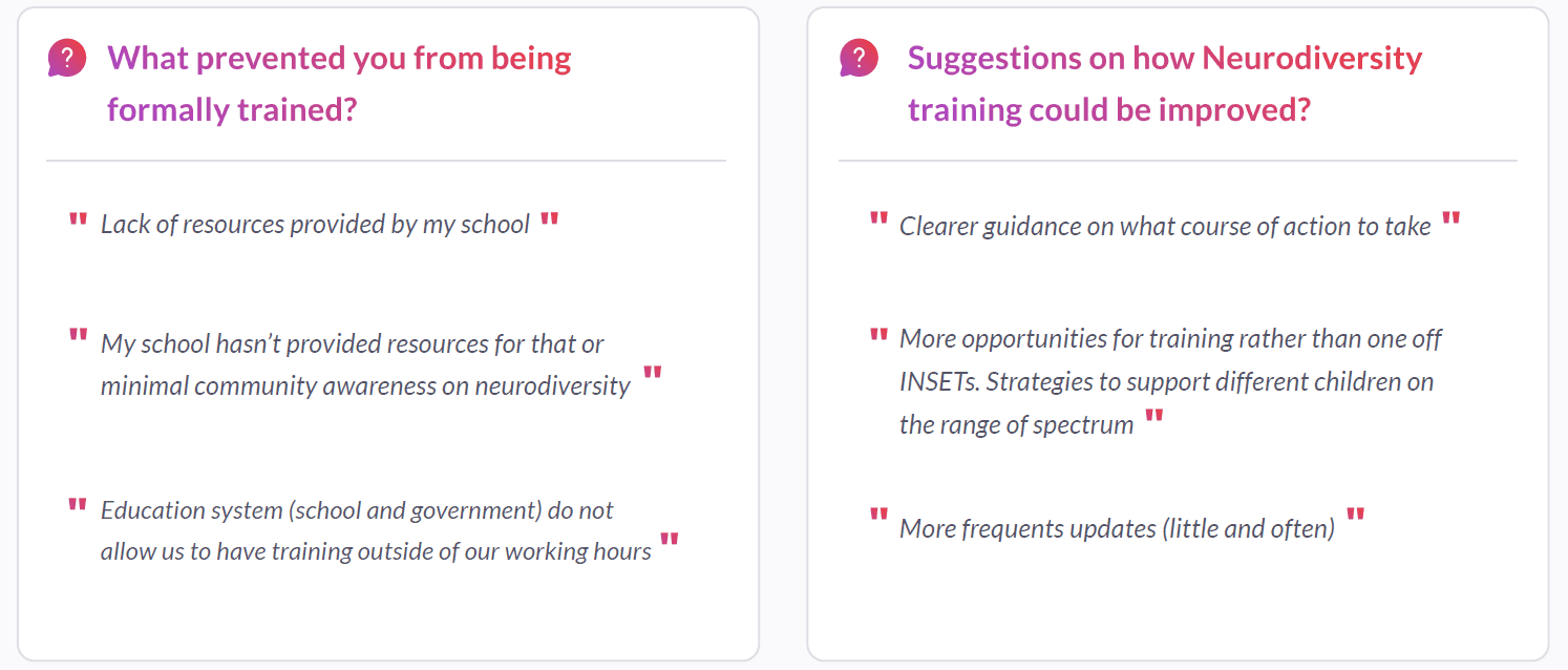
Why does this matter?
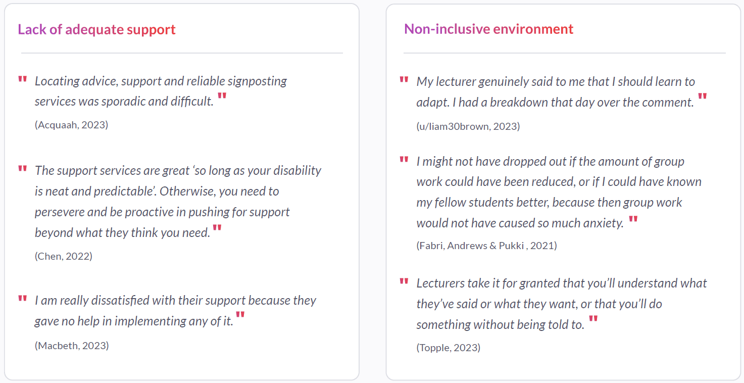
Validating problems discovered through survey
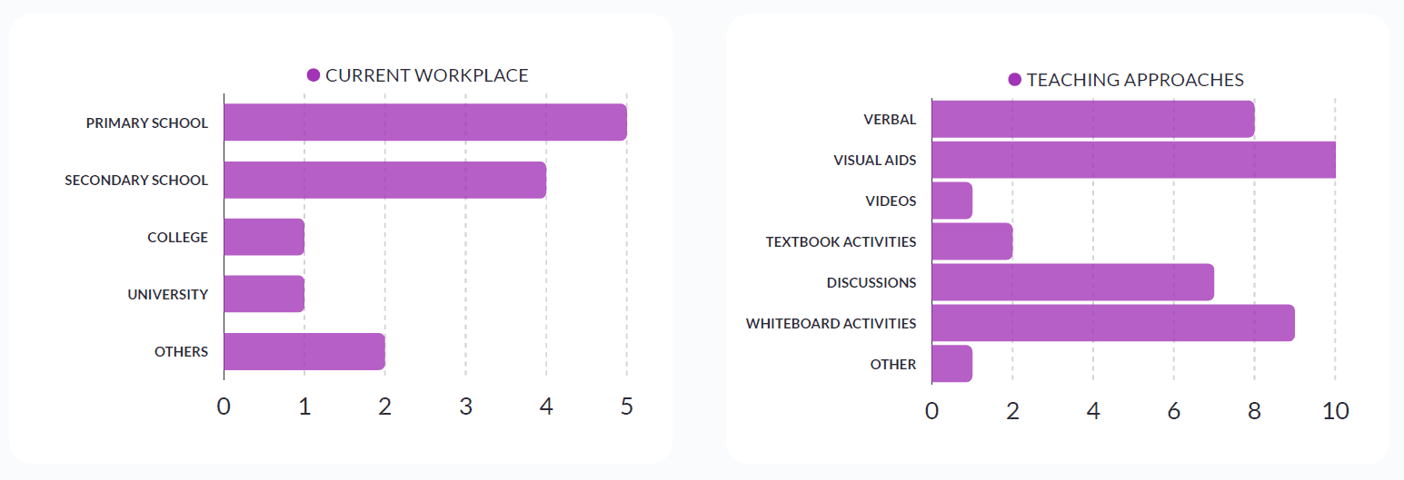
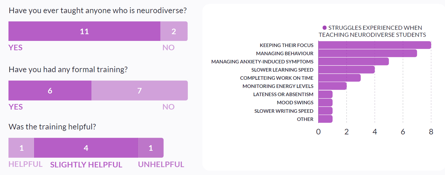
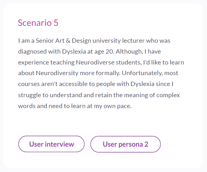
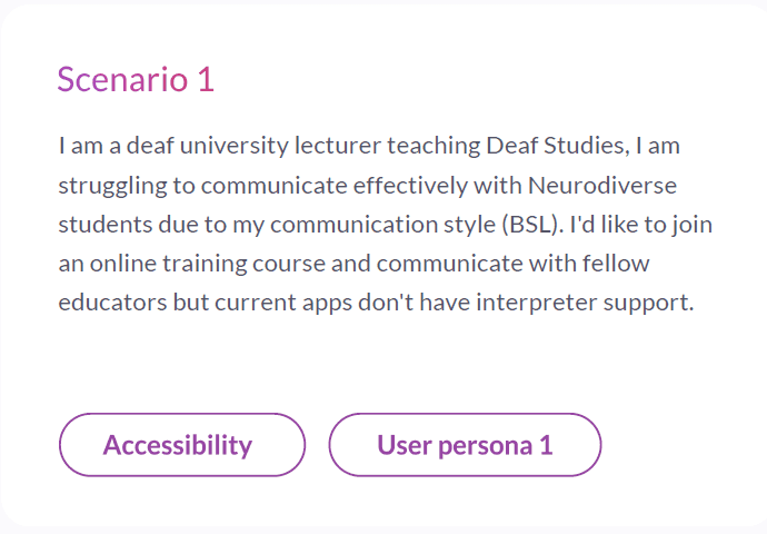
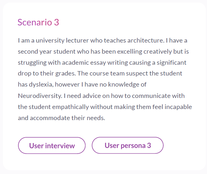
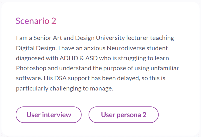
A survey was conducted to understand the issues educators face in terms of training support and experience with neurodiverse students

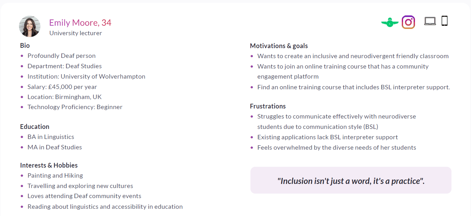
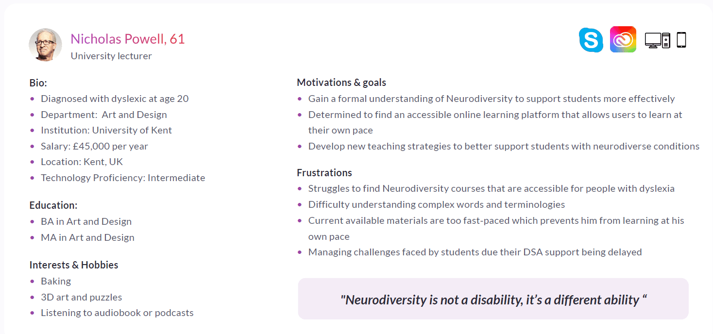
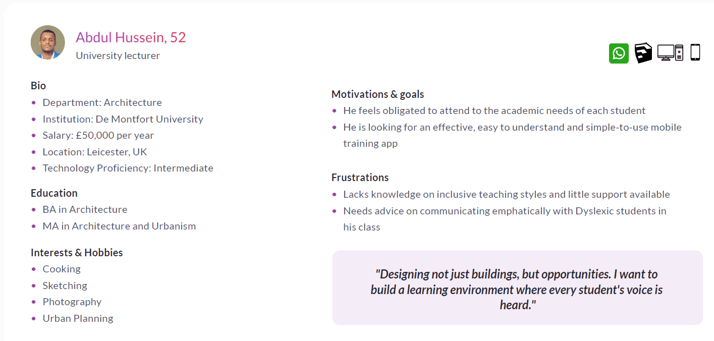
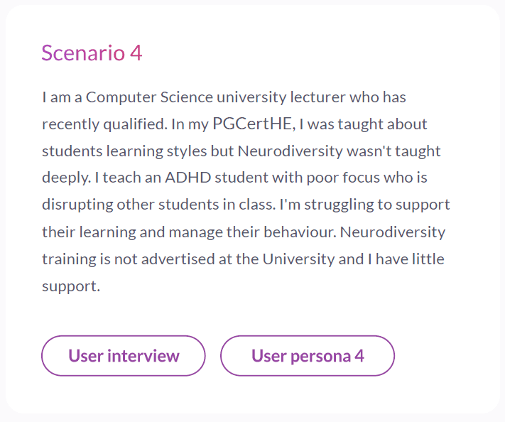
Creating personas and user scenarios
Based on the survey and user interviews conducted. Pesonas were created to guide design decisions and product ideation

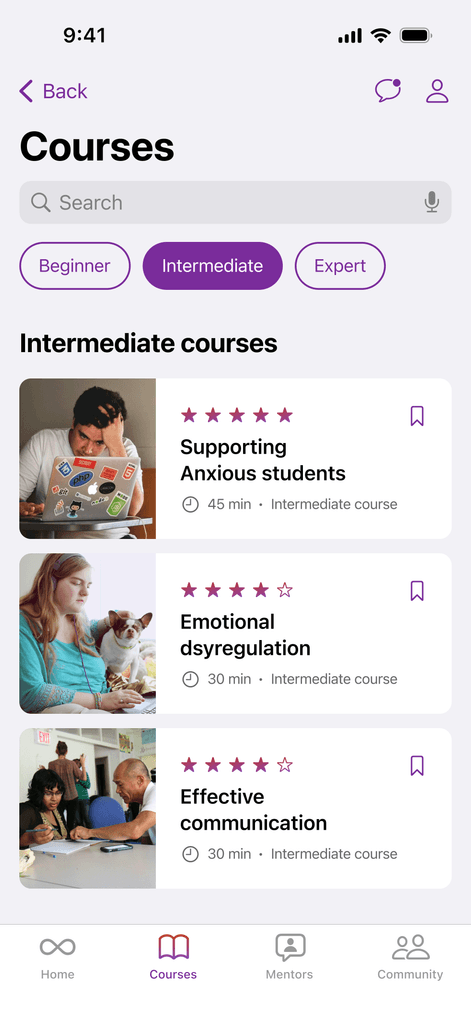
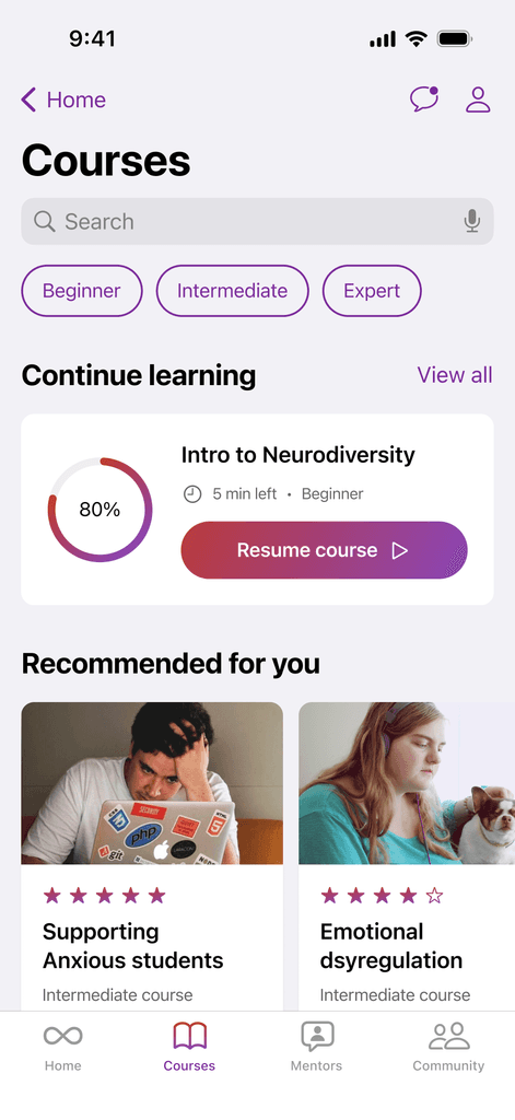
Learn
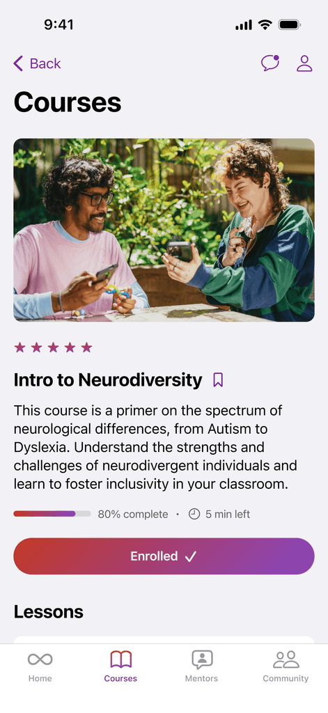
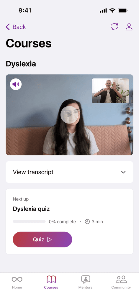
Access easy-to-understsand modules on neurodiversity and strategies to build an inclusive classroom
Practice
Get practical tips and strategies for teaching
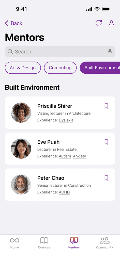
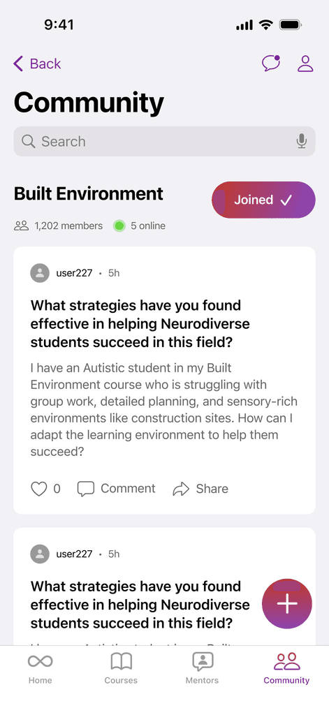
Connect
Join discussions with other educators
Track progress
Take quizzes and get feedback
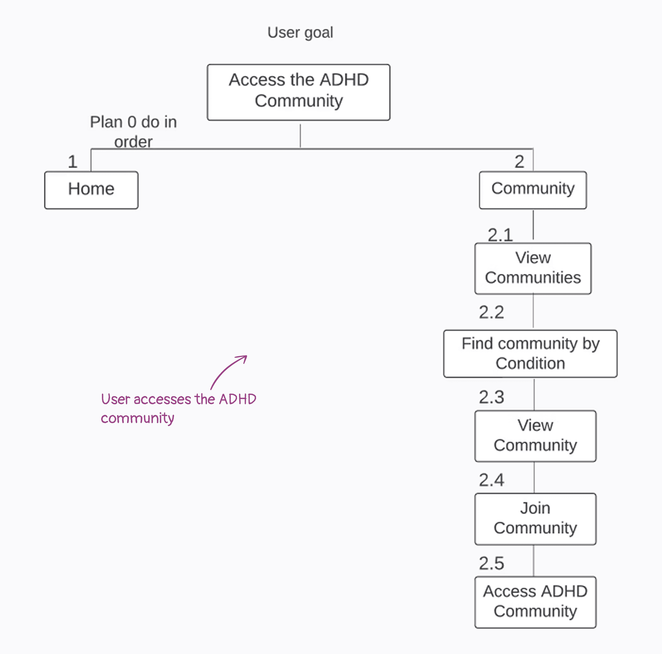
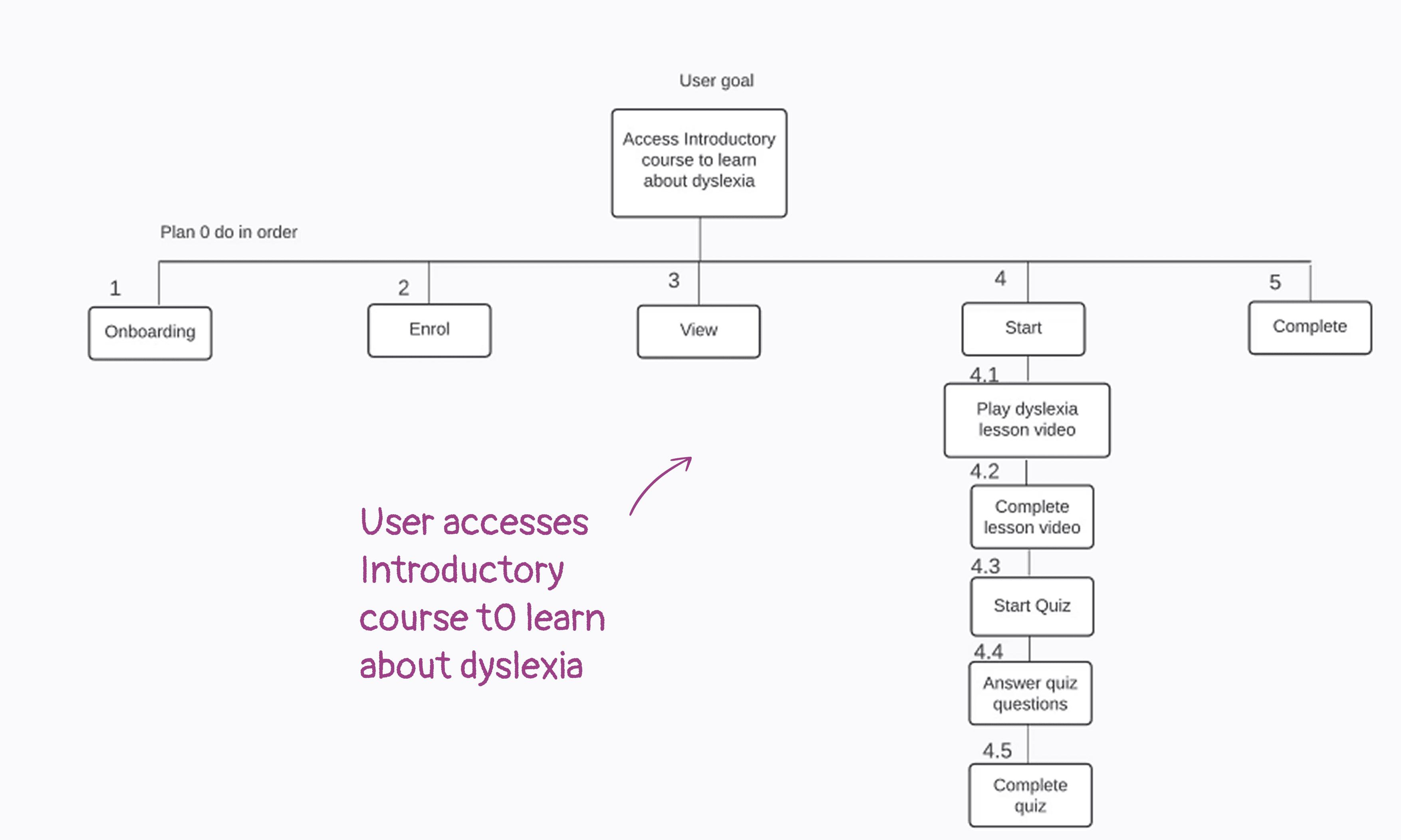
HTA
After figuring out what users needed through research and mapping that into personas and scenarios, Hierarchical Task Analysis helped to sturcture their goals into clear, step-by-step tasks.
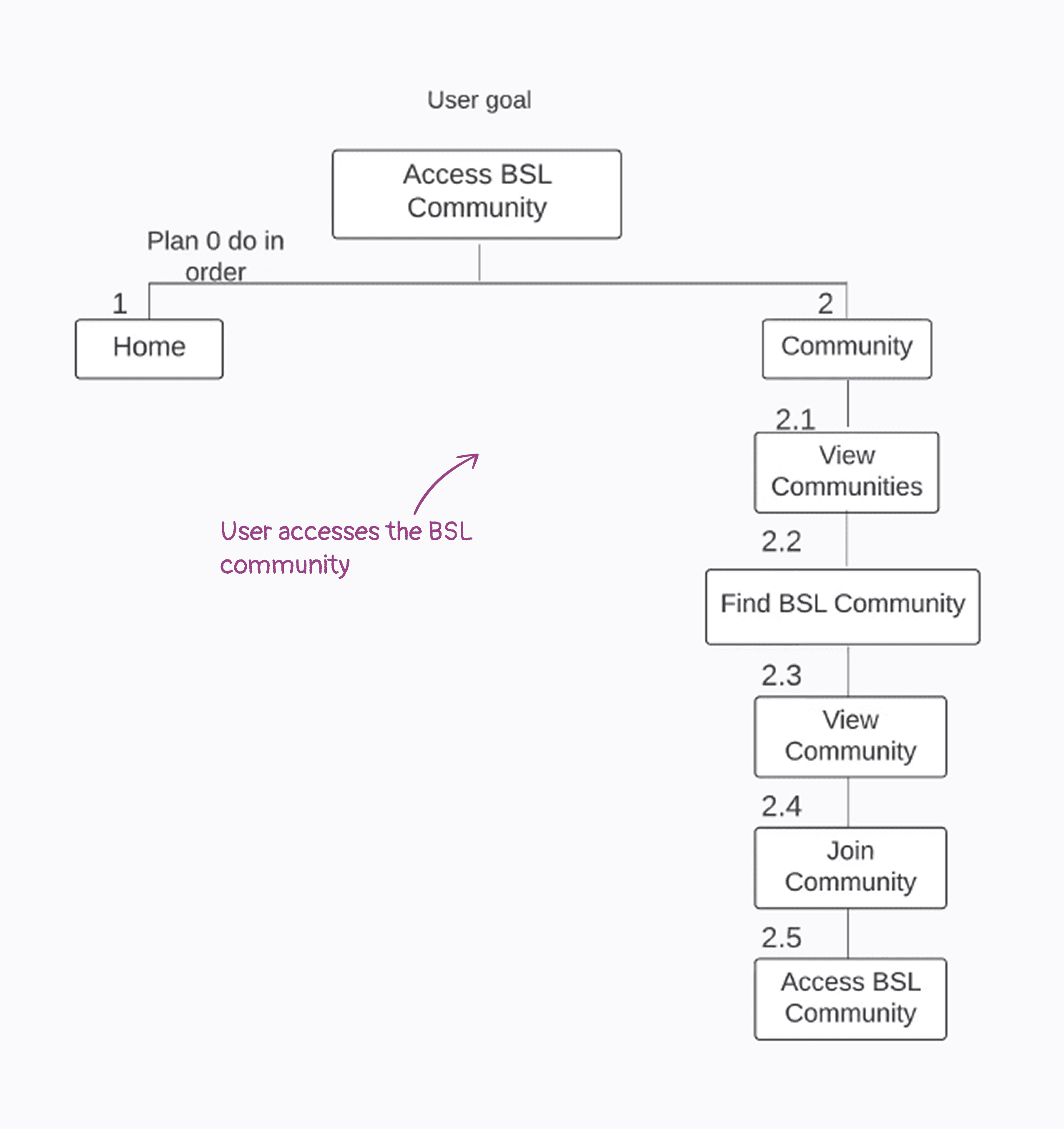
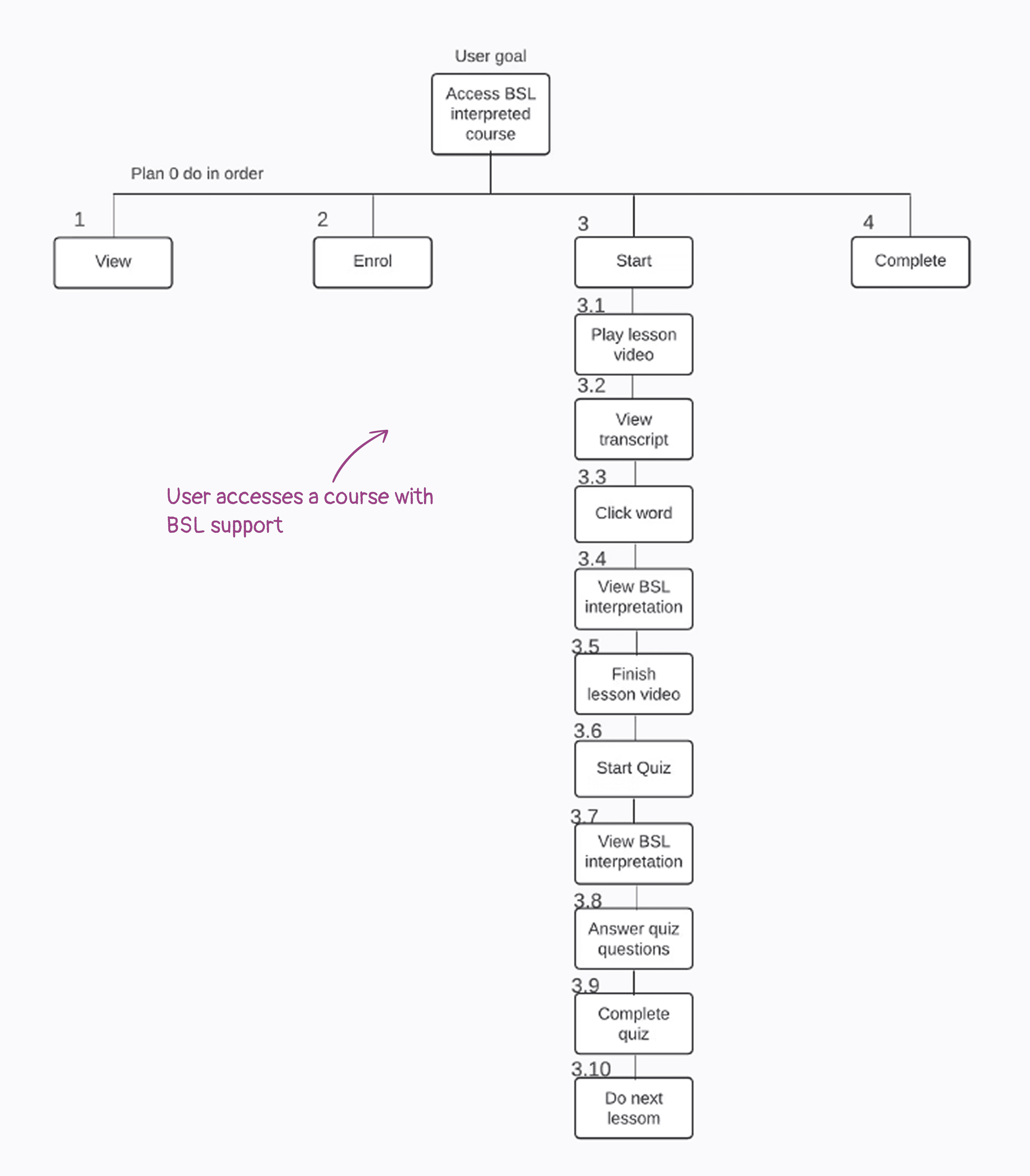
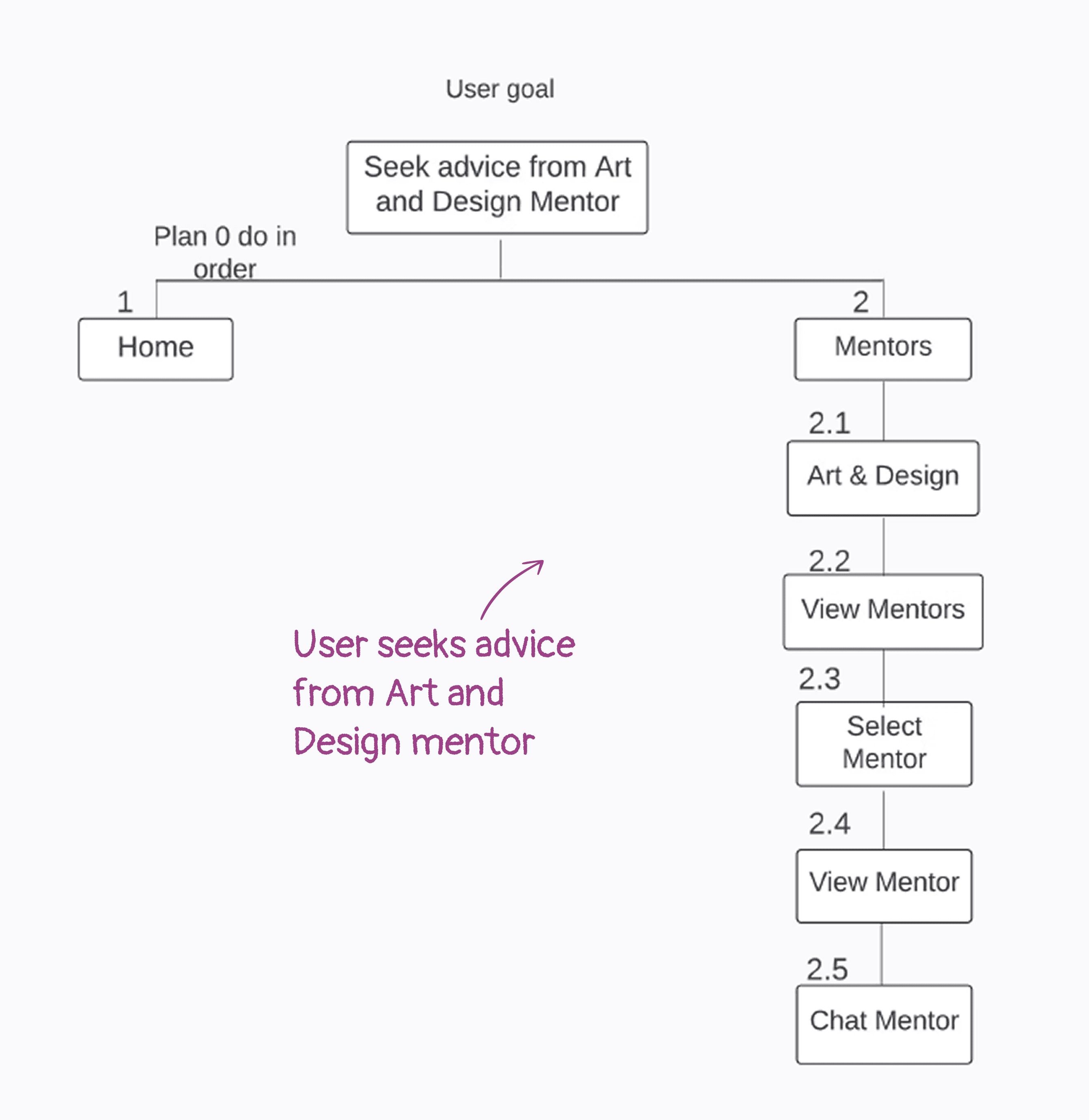
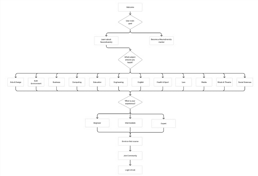
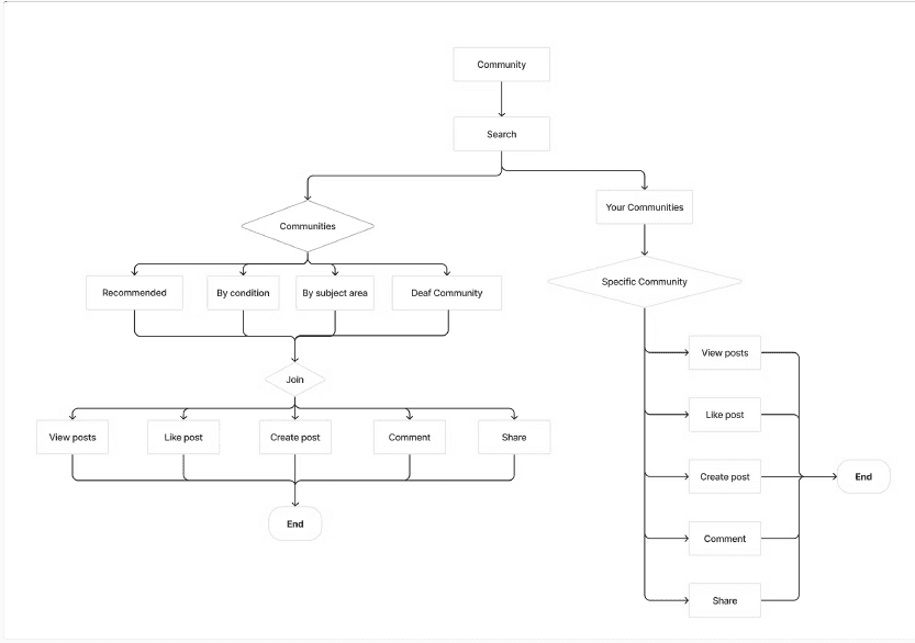
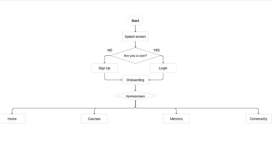
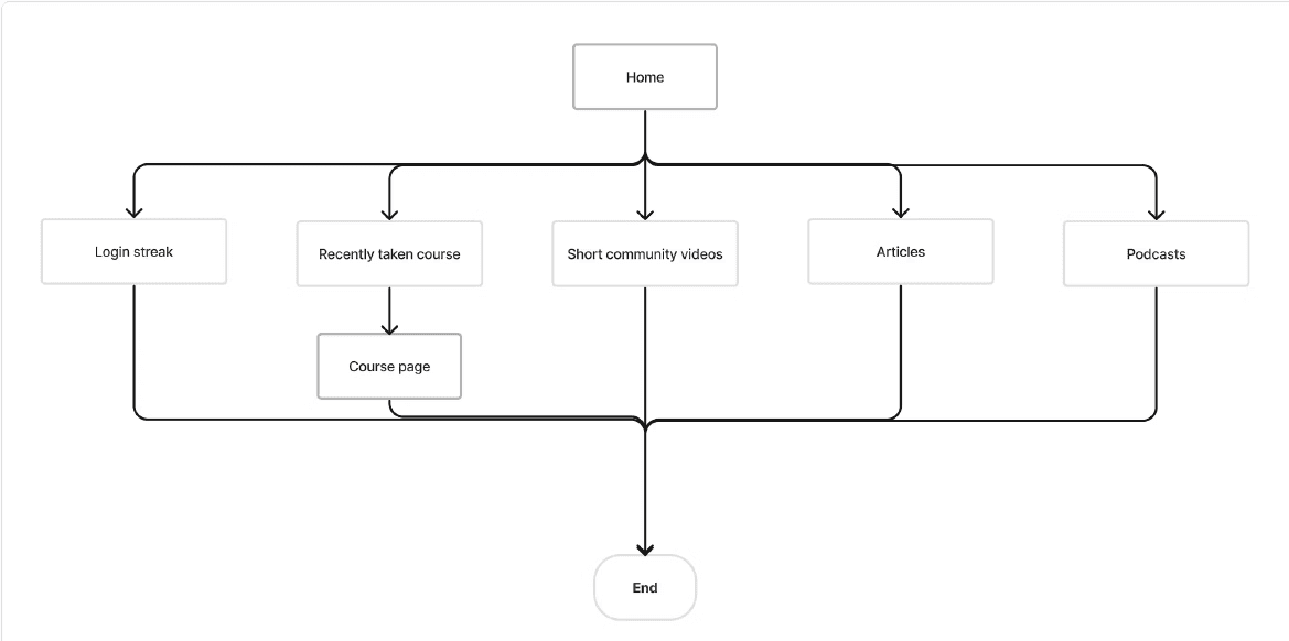
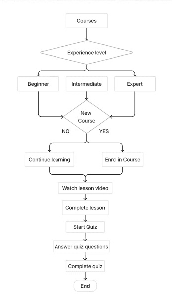
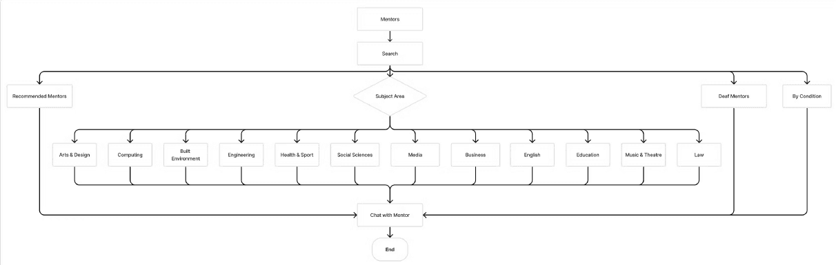
User flows
Created a user flow to map out how users would move through the app to complete key actions, making sure the experience felt smooth and intuitive from start to finish.
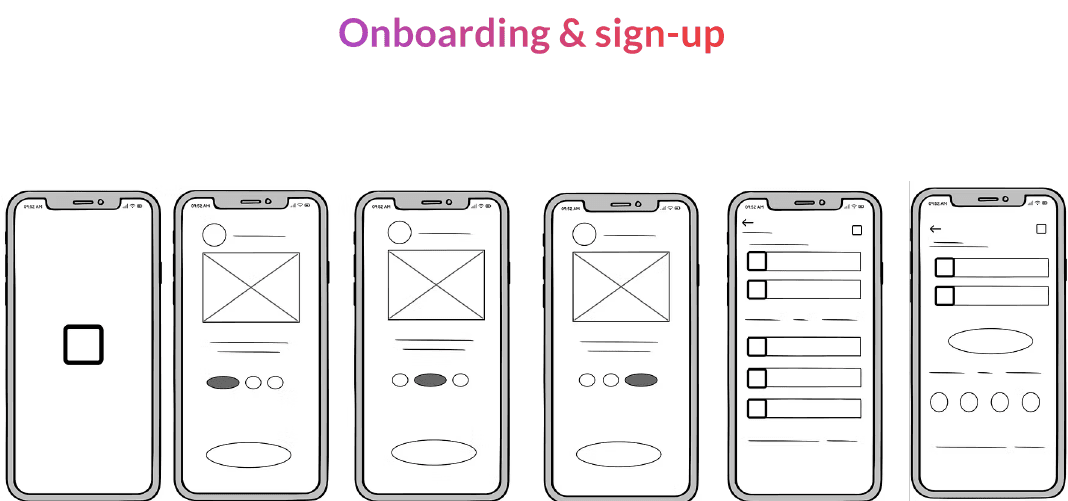
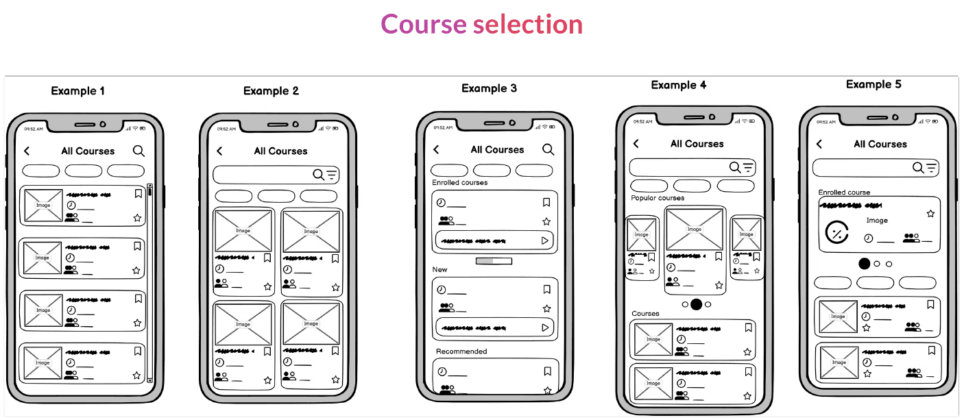
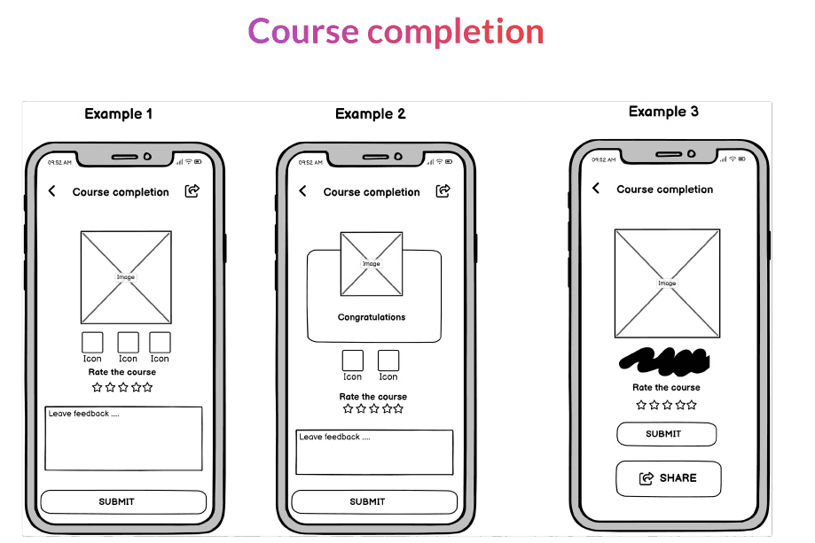
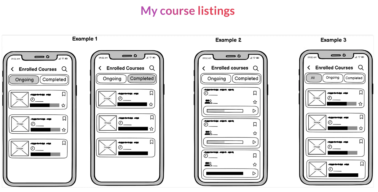
Ideating and sketching
Explored different approaches but went with a simple, minimal layout since potential users are educators who have busy shcedules and need a product that is easy to navigate with the right information


Visual Design
The visual assets for this project are thoughtfully designed to create an engaging and cohesive user experience while reflecting the core purpose of the product after sacling down on the screens from the sketches

The app was tested for usability with real potential target users (educators)
User feedback
All participants said they would use the app to improve how they support neurodiverse students, especially when it comes to creating more inclusive learning environments.
90% of users responded positively to the modern design and user interface.
85% of participants rated the Mentor feature as the most valuable part of the app.
60% of users found the “Mentor/Learner” terminology confusing, suggesting a need for clearer, more familiar language.
Recommendation
Improve wording for the “Streak” feature: Users suggested cleare terminology to better communicate the purpose of maintain activity streaks.
Recategorise communities and add preview descriptions: Participants found it difficult to navigate or choose the right community. Reorganising them into clearer categories with short descriptions
Remove mentor rankings or ratings: Some users felt that ranking mentors was unnecessary or could create pressure. Instead, focus on qualitative feedback or highlighting availability and expertis
One key lesson I took from this project is that even when tackling a large, complex issue like improving support for neurodivergent students in higher education, following a structured human-centred design process can lead to solutions that are both meaningful and actionable. Although there were many potential features I could have included, I learned the importance of prioritising what truly resonates with the target user.