ONLINE SHOPPING
Improving online cart-to-order shopping experience

Timeline
From explorations to final designs in 6 weeks
Background
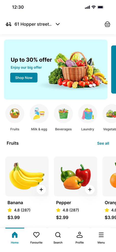
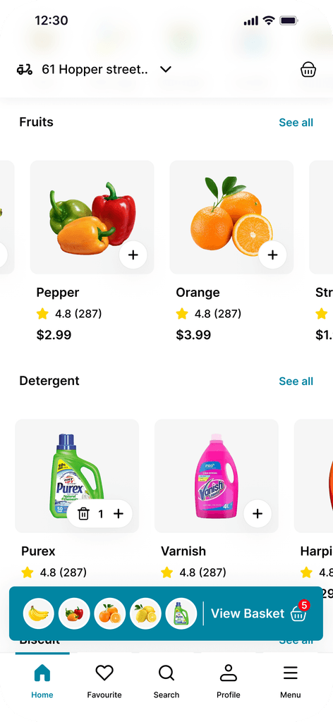
Grocerly aims to streamline the grocery shoppping experience for users by increasing user order engagement experience focusing on reducing cart abandonment rates
Problem statement
Despite exponential growth of online shopping, online shoppers abandon their carts primary caused by lack of seamless user expereince and insufficient engagment in ordering process. Current research lacks solutions focused on grocery retail where perishable goods add urgency to the decision making process.This study aims to analyze user behavior in grocery e-commerce to develop a UX model that minimizes cart abandonment through real-time feedback
Goals
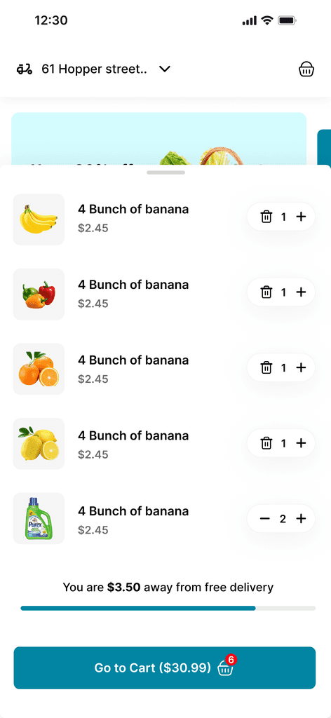
Improve ease of use and engagement with the cart
Reduce cart abandonment rates
Easy view of cart with reduced user flow
Understanding
Define
User Personas
Empathy Map
User Journey
Ideate
User Flow
Information Architecture
Design
Wireframe
Hi-Fi Designs
Prototype
Test
Feedback
Conclusion
Future Concept
Incentivization
Dynamic interactive feedback to spend more for incentives
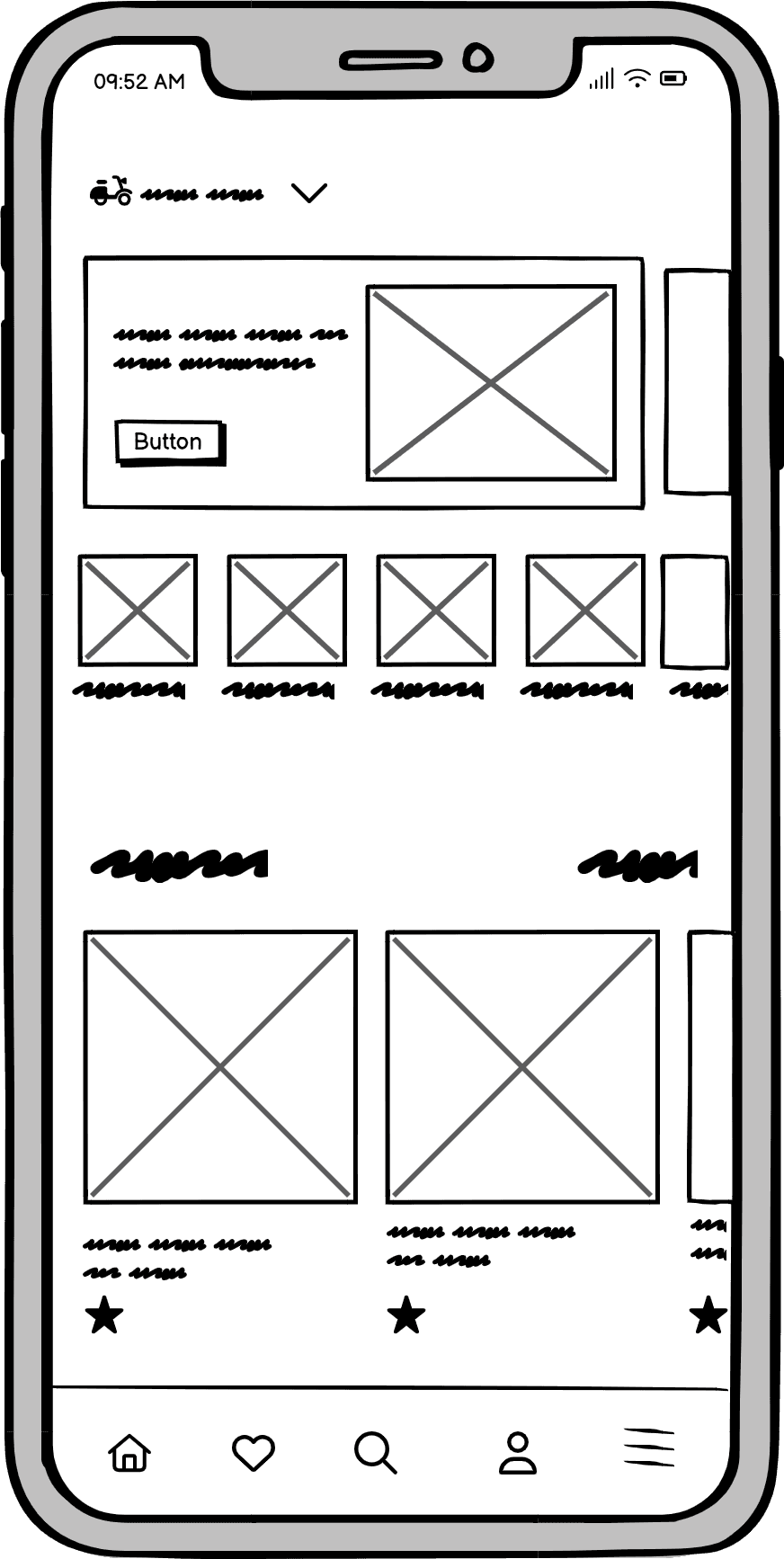
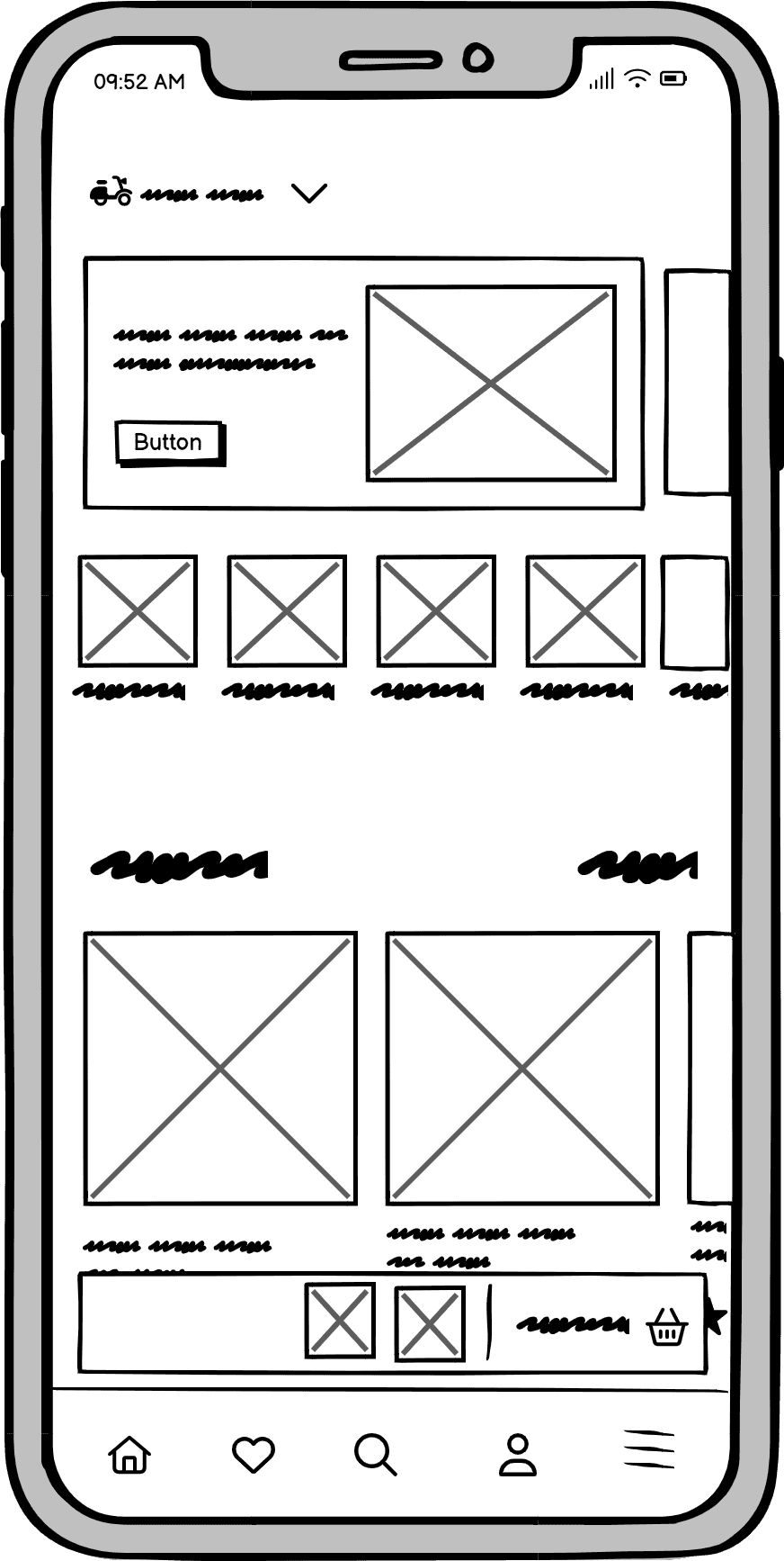
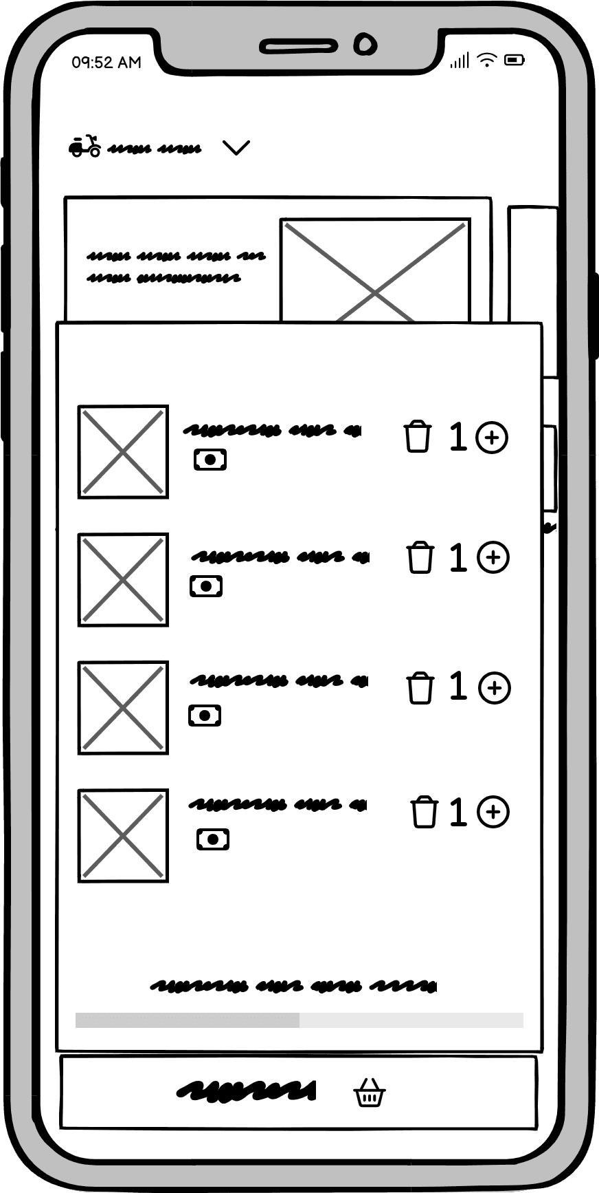
Visual Feedback
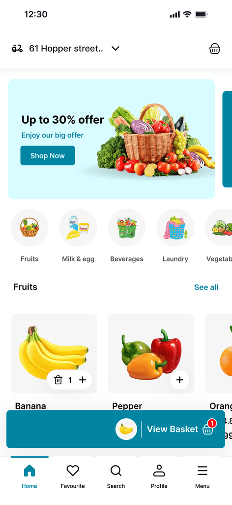
Users appreciated the clear focused visual feedback when adding items.
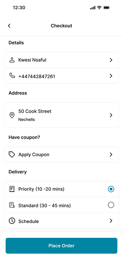
Quick checkout time
Users found the proudct icon interaction when adding items transaparent which increased quick checkout time
Less order review time
Users reported less time to review order page because they had a real time preview of ordered products when adding to cart.
