Redesigning Nylah, a legacy e-commerce store into high-converting experience
ECOMMERCE PLATFROM

The product
Nylah’s Naturals is an afro haircare ecommerce brand with a strong product-market fit, trusted by women seeking effective solutions for textured hair. The company prides itself on using all-natural ingredients, science-backed formulas and an inclusive approach to beauty and wellness
Problem summary
After conducting user research, as the sole designer of this ecommerce store targeting Black women aged early 20s to 60s, I set out to create a user experience that supports women navigating hair loss while balancing work, family, and caregiving. For them, hair loss is emotional and deeply personal — not just cosmetic.
The last thing they need is a slow or confusing website. That’s why I prioritised clarity, speed, and trust. The design is mobile-first, with a clean layout, intuitive navigation, and minimal steps from browsing to checkout whilst adhering to WCAG 2.2 guidelines. From education to purchase, the journey should be seamless with no clutter.
The web application was visually overwhelming, lacked clear hierarchy and created friction in the user journey. Key conversion and engagement indicators such as conversion rate, checkout completion rate, scroll depth, bounce rate and product interaction were negatively affected.
Cluttered layout with poor visual hierarchy and outdated UI causing cognitive fatigue
Overuse of primary brand color and dense text led to visual fatigue
Disruptive cart flow with redirects after adding to cart
Low mobile optimzation with cluttered and inappropriate layout
Overwhelming product pages due to poor layout and content overload with unclear CTAs
Critical content (e.g. “how to use”, FAQs) were missing
Lack of clear social proof but aggressive upsell tactics
Some screens of the old website layout


The goal
The goal of this redesign was to modernize the experience, reduce cognitive load, improve usability to target customers as about 85% of customers are between the age range of 28 to 60. this represent a large from of busy women
Streamline shopping experience for quick, confident decision-making on all device screen sizes prioritizing accessibility
Enhance content and layout clarity and visual hierarchy
Boost conversions by reducing cognitive load
Reflect the premium, wellness-driven brand identity
Research and Insights
I conducted
UX Audits using analytical tools to track user interactions and drop-off points and audit sales funnel.
Customer interviews and gathered customer related enquiries from customer service team and feedback surveys with returning customers
Benchmarking top performing ecommerce brands with similar buyer personas for competitor analysis
Some findings
Users found the homepage overwhelming and the use of primary bright orange color on all pages causing cognitive overload
71% of visits abandoned carts after being redirected to cart page after adding just one product to cart post "Add to Cart"
Auto-selected upsells and improper layout of upsells were perceived as pushy on individual product pages
Users found the product page layout overwhelming and not clear CTA as page was condensed
High bounced rates as a result of unclear logical hierachy and visual clutter.
Typography, Iconography and Color Usage
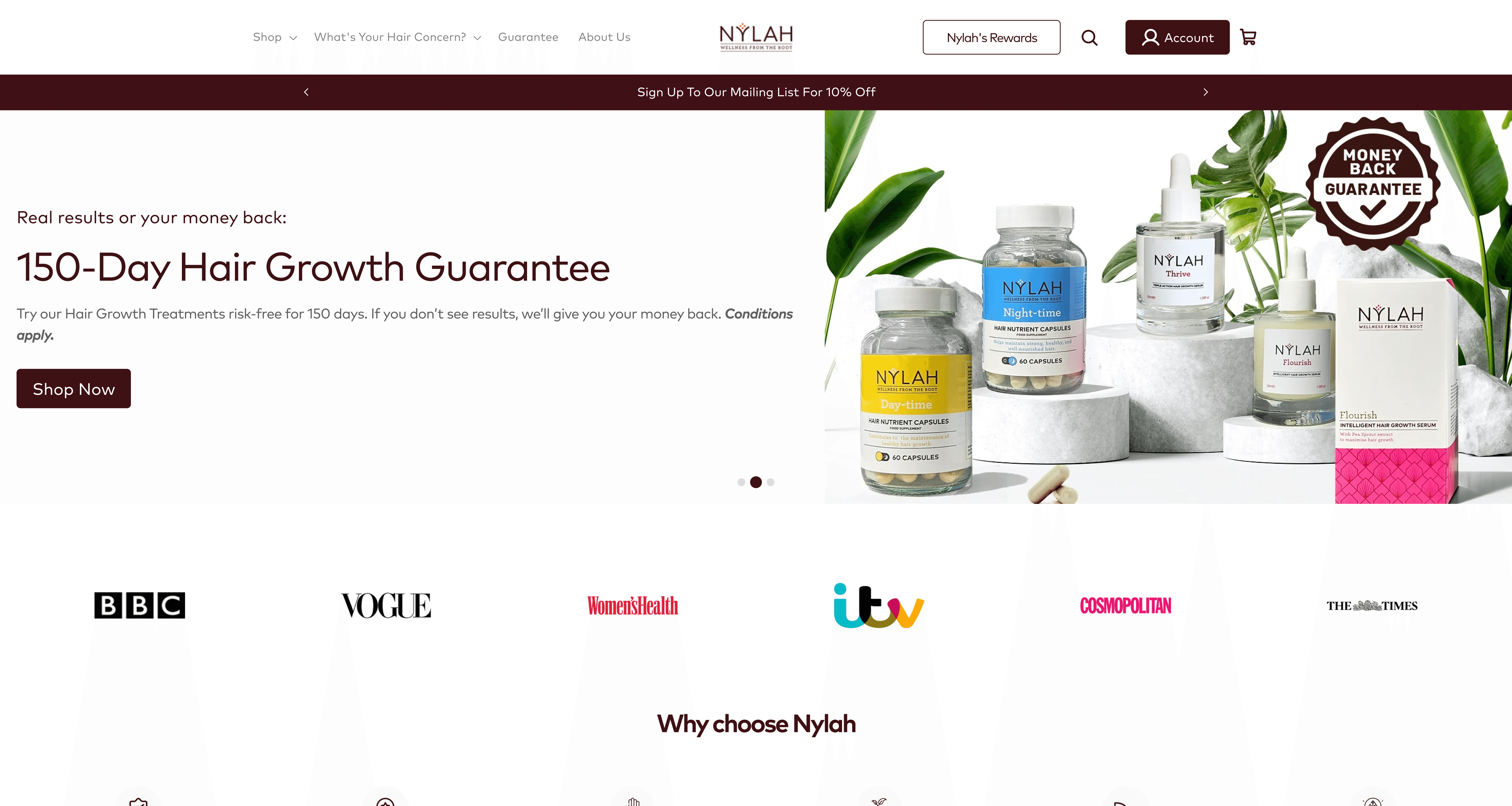
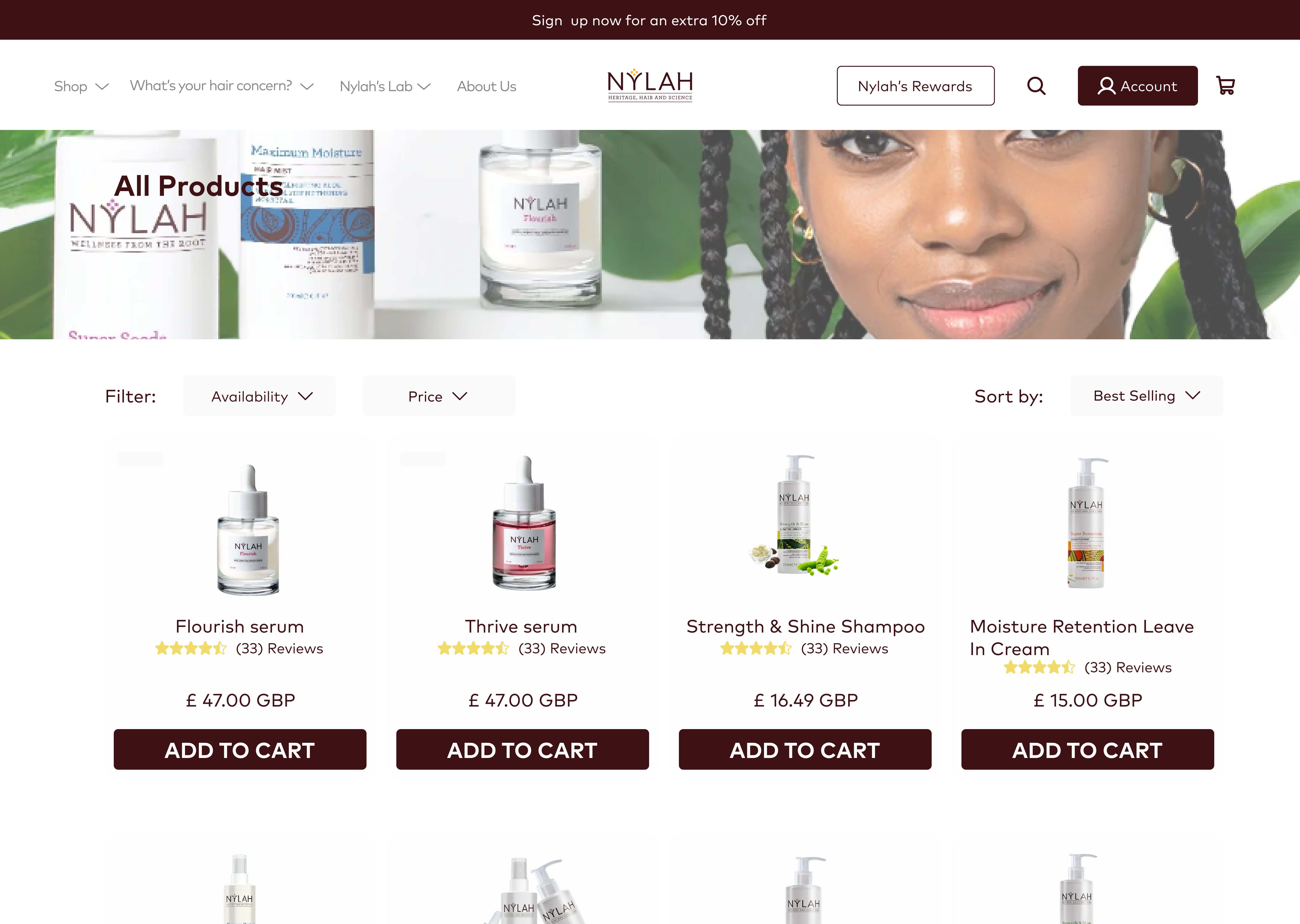
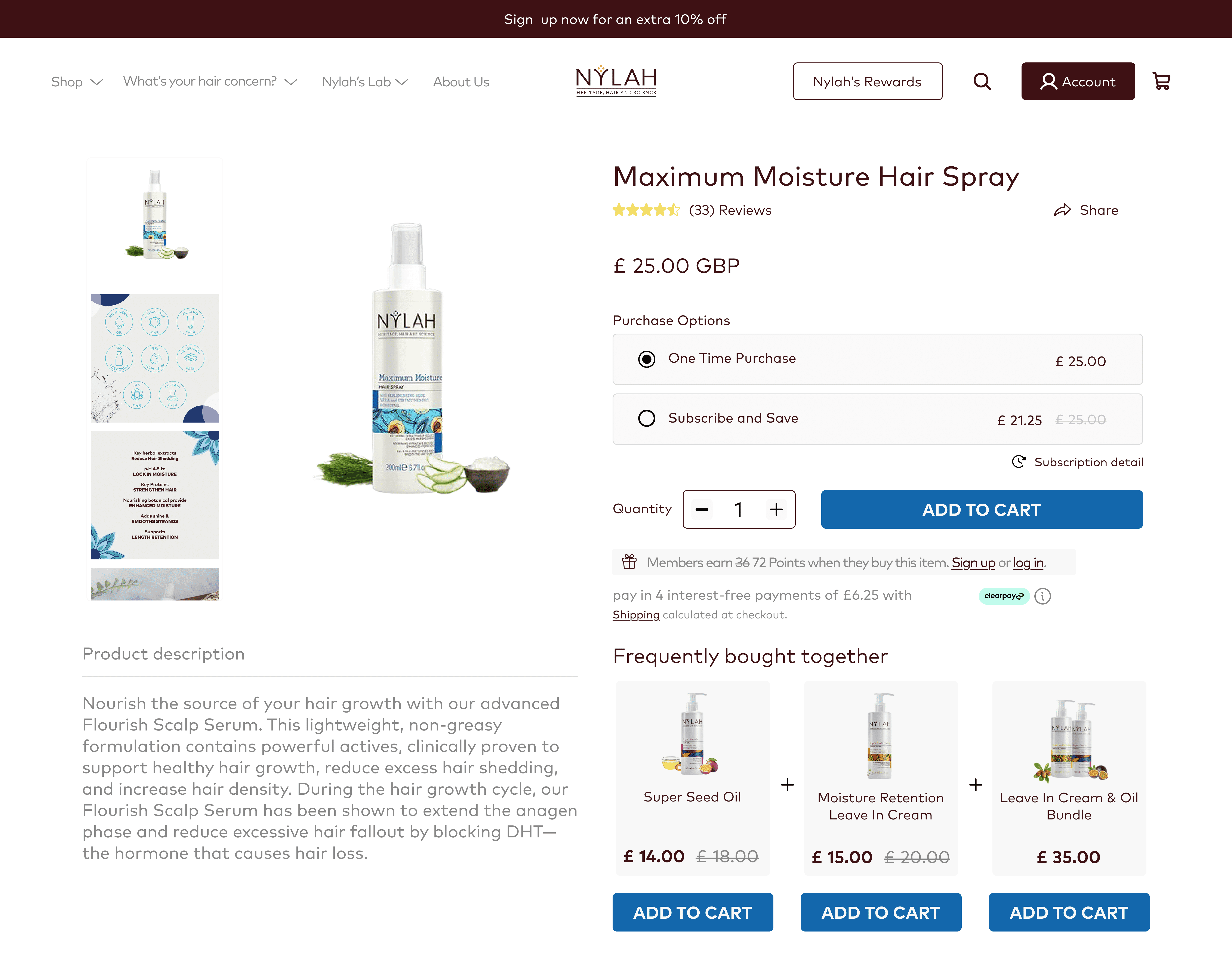
The primary overly bright orange was substituted with a rich dark brown tone, better aligned with the brand’s identity and its focus on afro-textured hair. I introduced generous whitespace to improve visual structure and reduce fatigue. Each product page was personalized by incorporating accent colors drawn from the product packaging (e.g. purple for the Flourish Hair Serum) enhancing emotional connection and clarity. Also I replaced generic icons with more brand-appropriate, humanized alternatives to strengthen the visual identity and improve UI cohesion.
Layout and Visual Hierarchy
The existing layout was visually overcrowded, with dense imagery, minimal whitespace, and inconsistently placed sections across different pages leading to a cluttered and confusing experience. To resolve this, I implemented a clear visual hierarchy using intentional spacing, sizing, contrast, and modular layouts. I reduced cognitive load by breaking content into shorter, scannable text blocks, aligning elements consistently, and introducing generous whitespace to create visual breathing room. These changes improved content flow, enhanced readability and allowed users to navigate and digest information more comfortably across all pages.
Improving navigation and Information Architecture
The navigation and information architecture lacked a seamless and intuitive structure. I resturctured the pages for improve navigation and improve the information architecture by how content is prioritized and ordered on the page and how pages are linked and nested for a smooth user journey from browsing to complete checkout even for new visitors. This was influenced by looking at analytics and customers reported feedback. A mobile-first apporached was used as about 81% of traffic to the page was mobile devices. This enusred the core focus of converting visitors to buyers and subcription based customers.
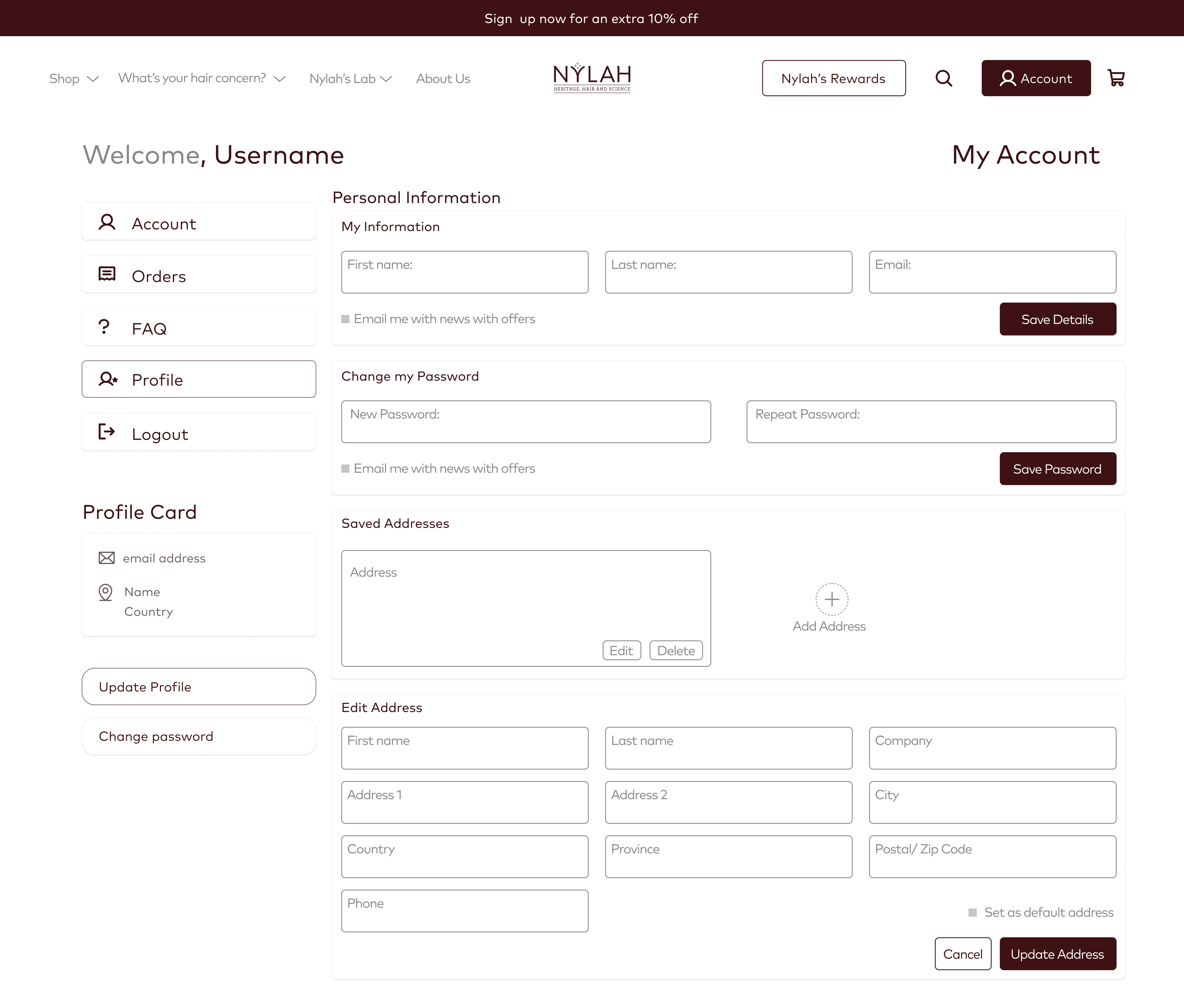
Functional and UX Clarity
To improve mobile usability and reduce friction in the shopping experience, I replaced auto-scrolling sections with swipeable carousels and static grids, giving users more control and reducing eye strain. Product cards were redesigned with clearer visual hierarchy and ample whitespace, creating a cleaner look for easy scanning.
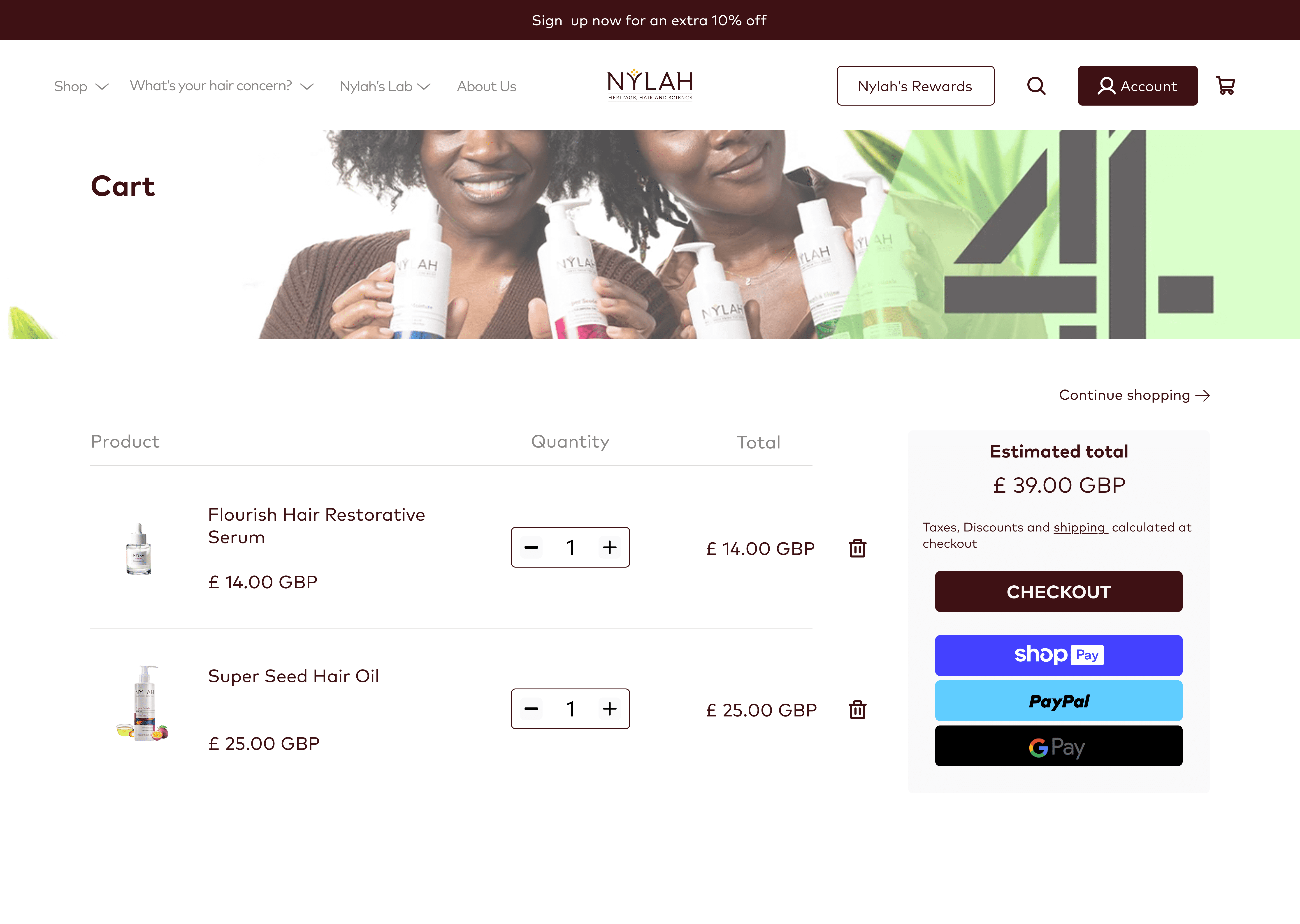
The cart-to-order journey was optimised by introducing an interactive and improved side cart, eliminating the need to redirect users to the cart page after each "Add to Cart" action. This allowed users to continue browsing without interruption and supported a more natural purchasing flow.
Recommended products were made more interactive, enabling users to add items intuitively with a single click instead of the auto-selected prodcuts which disreupted purchasing flow. I also nested related product links within pages to encourage seamless upselling and cross-navigation.
Additional improvements included a more intuitive user account dashboard and better content prioritization across product and lead-focused pages, helping users quickly access key information and take action with ease.
Visual Design


Redesigning Nylah's ecommerce experience led to measurable improvements. Some of these outcomes are
Bounce rate over time decreased by 28% as online sessions increased, reflecting stronger online impressions and user engagement
Conversion rate increased by 12.48% which reflects low friction and intuitive user experience. 84% of session are though mobile device which shows website has seen significant improve for mobile optiomization
Customers reported the site felt “clearer, faster, and more reassuring” in post-launch feedback and customer service reported a noticeable drop in web app-related inquiries, suggesting fewer usability issues and more self-sufficient users
The updated experience also supported the marketing team with higher-performing landing pages
What I have learned so far?
Designing with empathy drives better outcomes. Understanding the emotional weight of the problem helped shape an experience that felt truly supportive and user-first.
Cross-team collaboration is essential. Aligning with marketing helped optimize conversion funnels, while close work with devs ensured designs were feasible and polished.